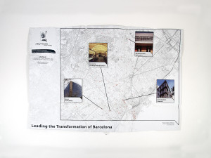
ARQFORUM is a leader company in the design and development of solutions in processes of transformation through architecture, urban planning and construction.
Challenge
The architecture studio, after a long career, faces a new stage focused on new international markets and position itself as a consultant to the renovation and transformation.
It is necessary to redesign its entire corporate identity to convey their new values and its transformative potential.
A new more powerful and character image.
Solution
The intention is to position the brand as a strong and specialized company with a global focus through simplicity, elegance and creativity.
We represent by a logo, mainly typographic, over a line of degraded colors, who wants to represent a new vision of the environment, a new way of dealing with transformation projects, renovation and regeneration.
But where it really conveys his potential and his strength is in the implementation of their identity through a new random and abstract view of the surroundings.
With the base of the 5 colors of the identity we create abstract figures seeking to represent their collaborative potential (interlaced elements), its transforming capacity by moving (change of shapes and colors) and its transforming capacity by formats (pop and expandable elements).


