Marídame is the meeting place of fine wines and selected food products, to experiment with their harmonies and make unforgettable dining experiences.
Challenge
Reinforce the values of Marídame through simplicity and elegance.
Create a sober but not boring identity. Forceful, with a modern and edgy tone (away from the traditional aspect of the wine world).
Apply identity to different elements through simple pieces, clear and direct content, with a strong didactic tone.
Solution
The logo symbol refers to the essence of pairing wine and food using the tools that bring us their products and the union of the two elements, the result is a simple and memorable symbol.
The logo (with its symbol, the naming (brand name) and claim (slogan) –wine meets food-) reinforce the definition of pairing, the union of wines and gourmet products. The imperative form of naming is an invitation to engage the user.
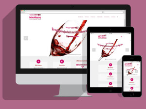
We create a striking and strong identity, supported by a collection of statements about the pairing wine and food, that explain or clarify some myths. With careful selection of bright and warm colors close to the wine, using only two inks.
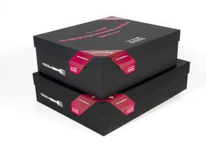
We develop multiple applications according to the needs of Marídame: Business cards, promotional piece customizable in two languages, wine dispenser card, miscellaneous for wrap and present products (paper, multi-use bags for packaging, labels for identification and printable, …), menu suggestions over engraved aluminum and templates to update its contents, Garment for staff, etc.
We also created elements to display the sheets of the products that explain their characteristics (bases for bottles of wine and three models of bases to accompany different products).


