


Nordicthink is more than a store, it’s a selection of furniture, lighting and accessories of contemporary nordic design.
Challenge
Submit to nordicthink as a benchmark in the selection of Nordic design products for household that combine functionality, simplicity and beauty.
Should convey the essence of the products they offer, be smart and stylish northern European.
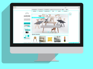
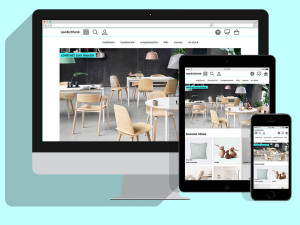
Initially the field was only online, later opened the first store in Barcelona.
Solution
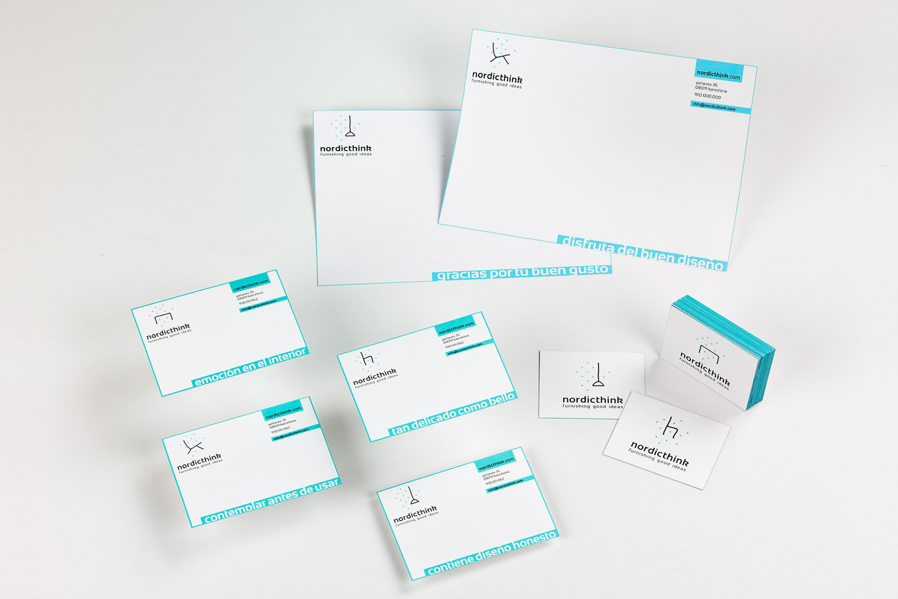
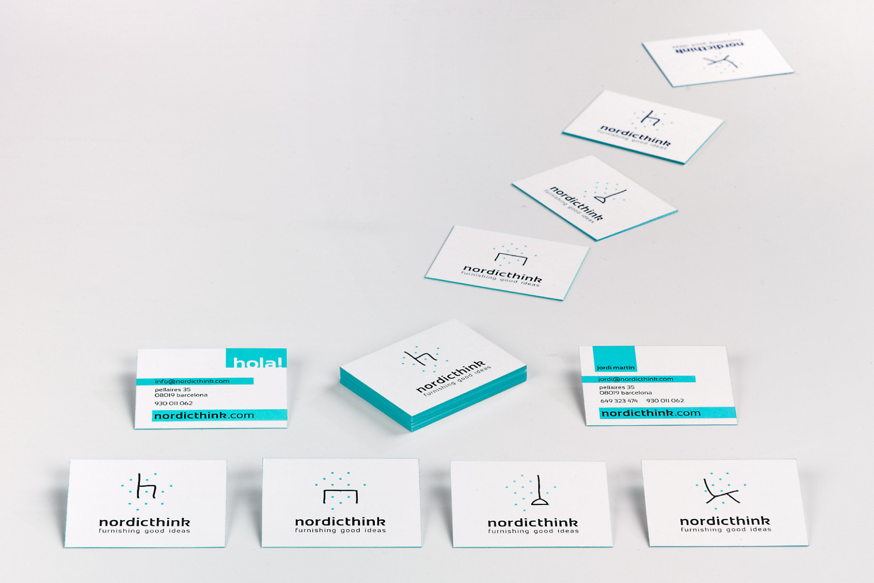
The Family of logos represents the universe of nordic design in which nordicthink identifies a constellation for each major product category (chairs, tables, lighting and seats).
In online media apply the four logos in an animated sequence, and in print applies are individually and randomly.
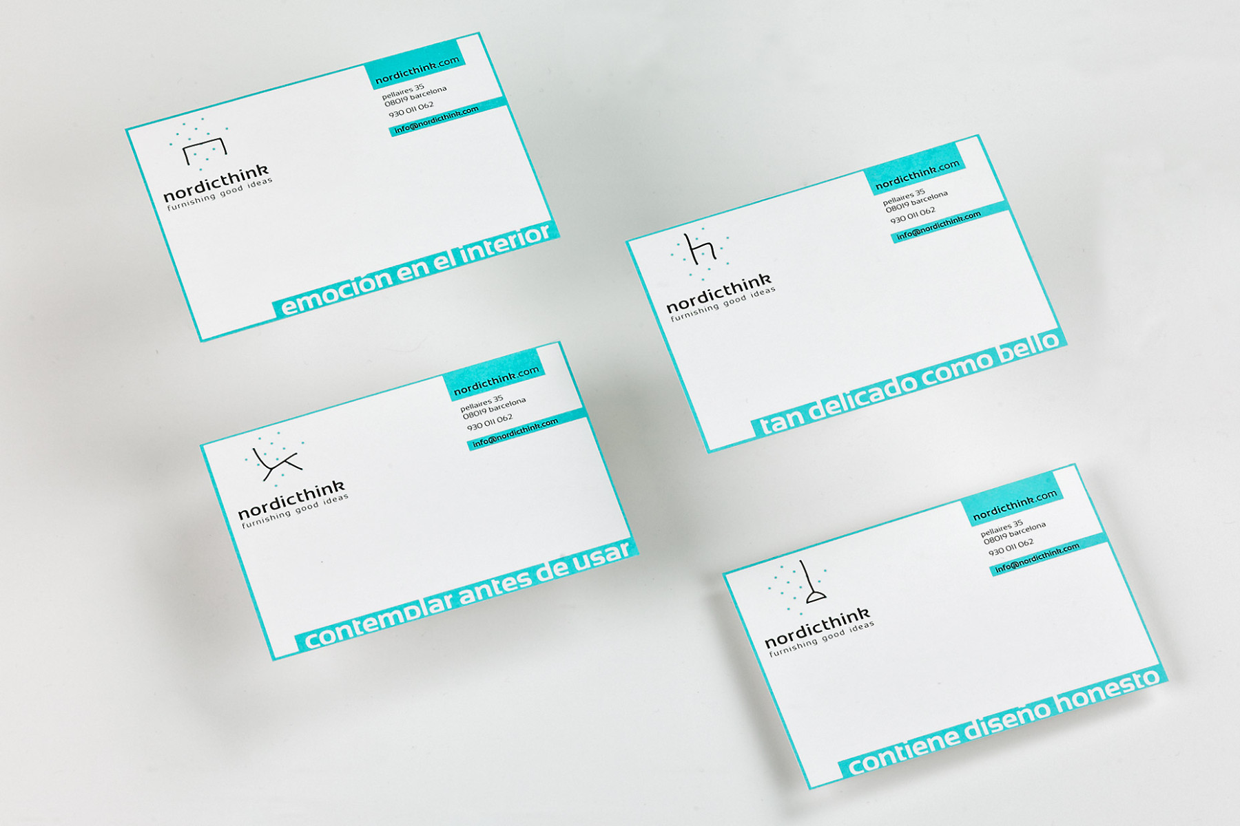
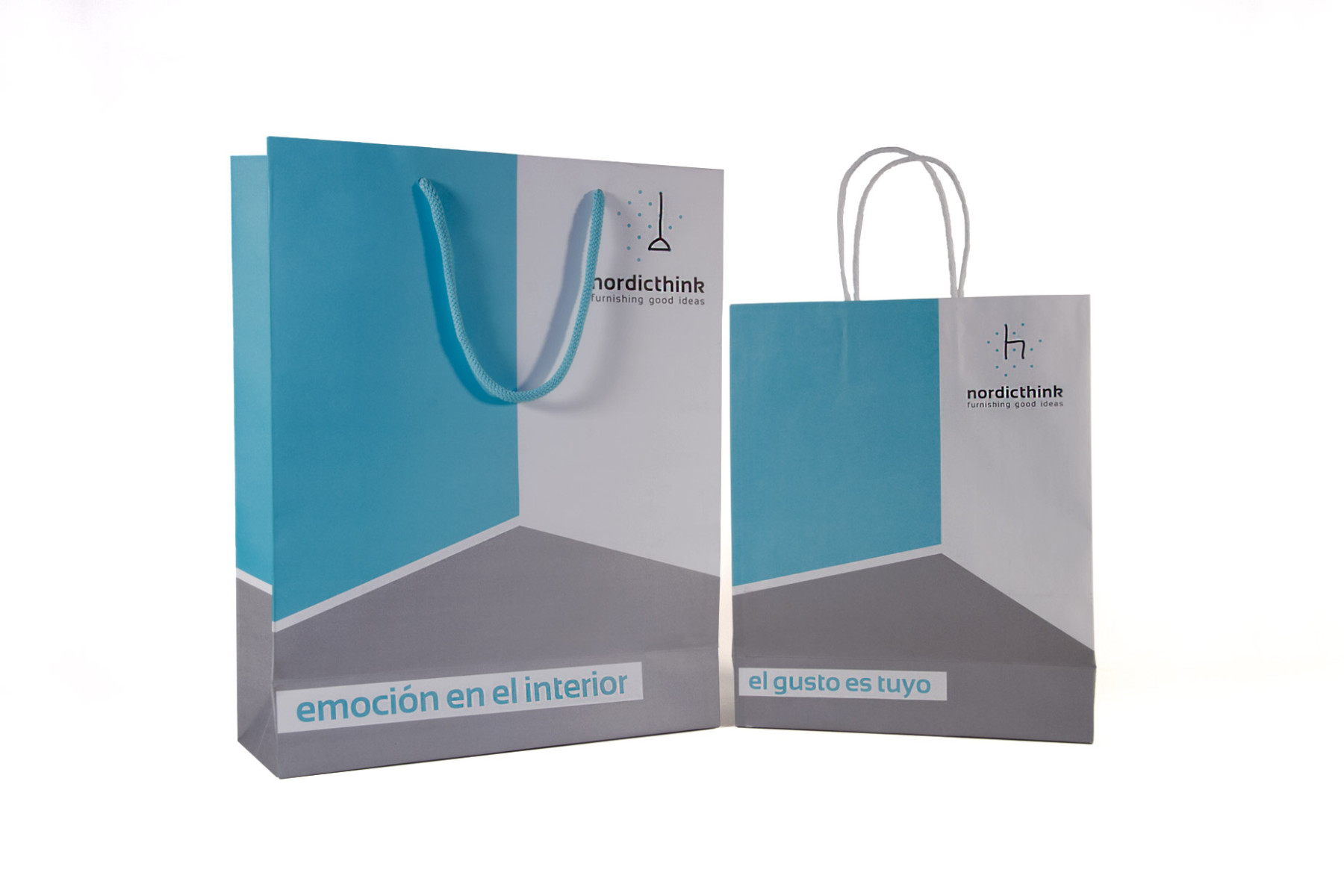
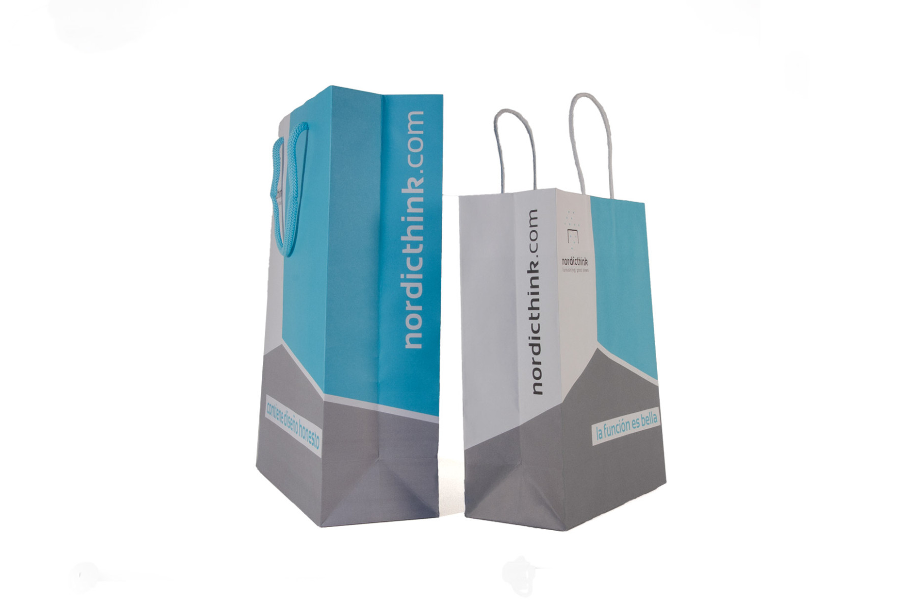
The stationery is complemented by a series of messages that convey a point of proximity and complicity. A gesture that reflects the brand’s attention for all the details. Some examples: “Thanks for your good taste”, “enjoy good design”, etc.
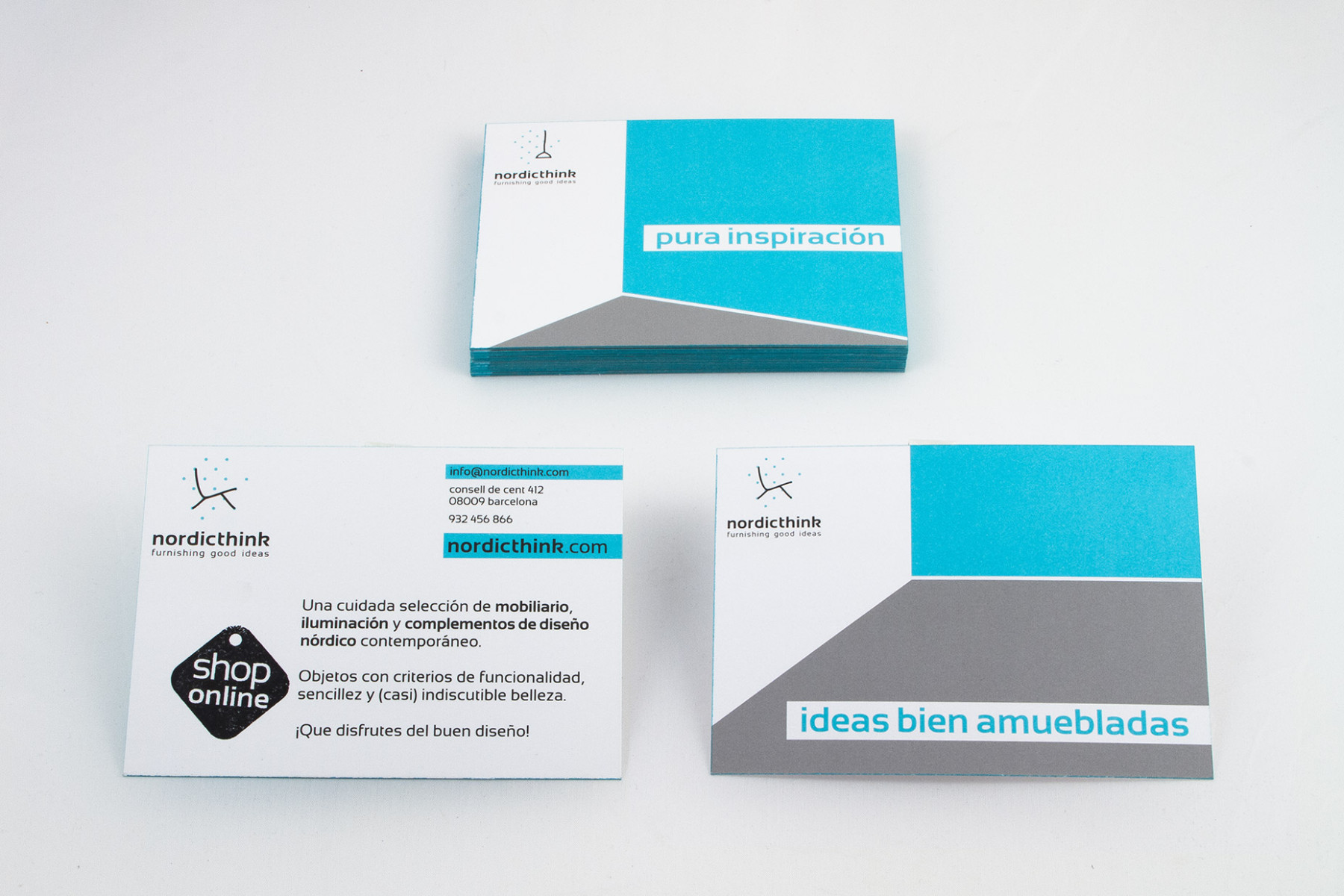
Promotional items (postcards and bags) are presented with a chromatic masses (with coporate colors) forming a figure that represents differents corners, referring to the space that will occupy the products.


