

Ca la Nuri is a group of Mediterranean cuisine restaurants with over 50 years of history.
Challenge
Create a system for naming restaurants, maintaining its own character.
Create a memorable brand with a clear and strong iconography. Make it deribable each of its restaurants maintaining the common identity groups them together, Ca la Nuri.
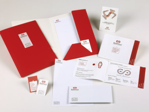
Simple communication pieces, without excesses, balanced and clear.
Solution
Celebrating its 50th anniversary was an excuse to make the change of identity, given the need to improve the different brands and articulate a trademark structure that overarching umbrella.
The first challenge was to build the family of namings (brand name) for each restaurant.
We define which should form a series, using elements linked to the environment, for its cuisine and its proximity different linkages:
- Platja (beach): its cuisine specializing in seafood and paella, and also because of its location beside the sea.
- Terra (land): for its Mediterranean and proximity cuisine.
- Foc (fire): for their stoves, specializing in grilled cuisine.
Instead of, for example, Ca la Nuri Platja, as was previously, the name of the main mark (Ca la Nuri), now passed to a second reading, inverting it in all cases. They will then: Platja Ca la Nuri, Terra Ca la Nuri or Foc Ca la Nuri.
The logo is defined by two semicircles with soft shapes that resemble the shape of a plate.
The different versions for each brand are articulated relying on colors in allusion to his name (blue-beach, fire-red, soft brown-land). To the main brand, we define its color was black, avoiding any conflict in choosing colors for future restaurants.
The pieces of identity are direct, without excesses, with an intention to convey simplicity and elegance.


