Multigrup is a company specializes in the restoration and rehabilitation of buildings and monuments.
Challenge
Define and redesign their corporate image.
Creating a brand that transmits its distinctive values: global solutions in the rehabilitation and restoration of buildings.
Solution
We create a strong identity, memorable and powerful. We seek to convey firmness and lasting solutions.
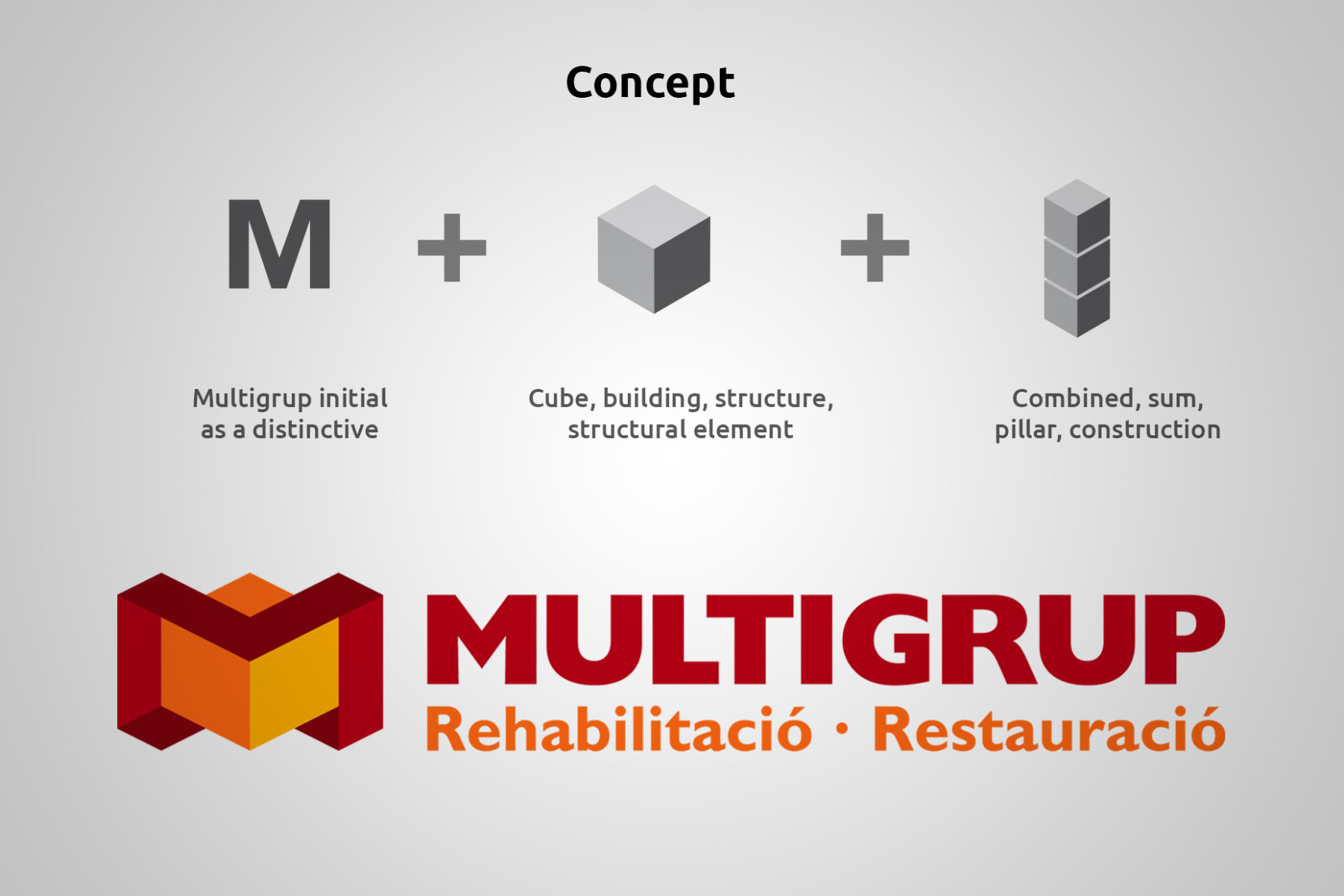
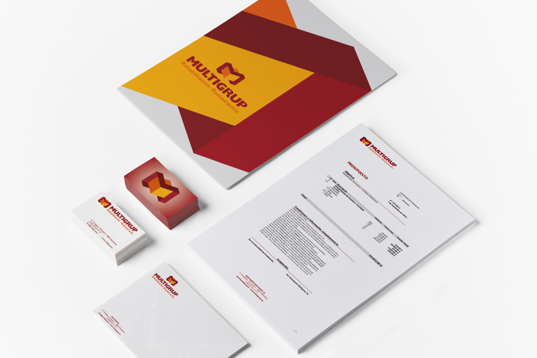
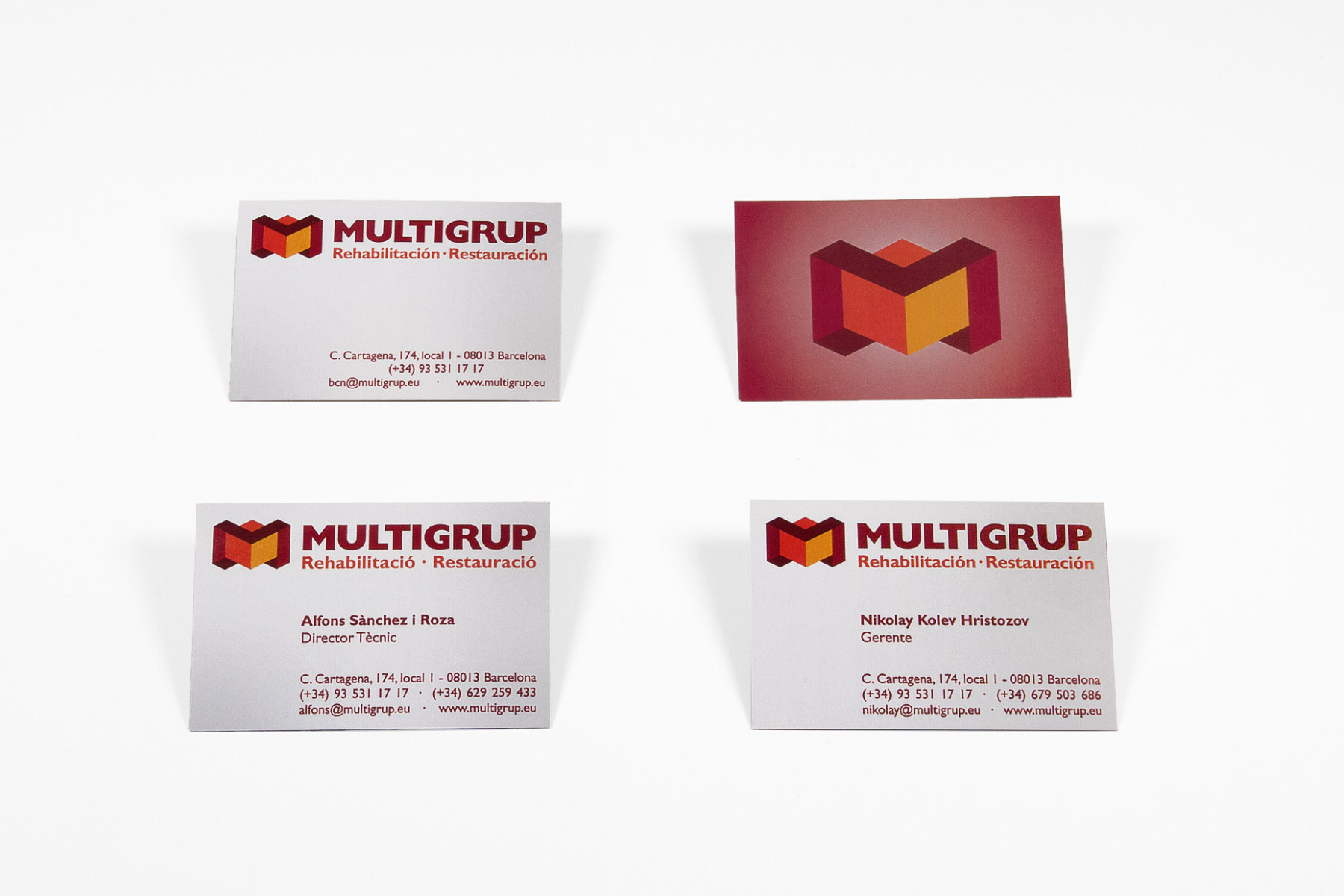
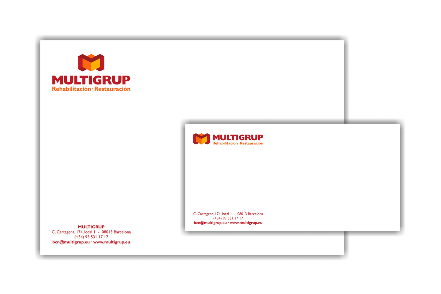
The logo is formed by a central cube (in reference to the building) surrounding by ribbons that forms letter M (the initial Multigrup), the concept is Multigrup cares and protects buildings. The colors are derived from the previous identity reformulate. The claim (slogan) enhances the service we offer, Restoration and Rehabilitation of buildings .
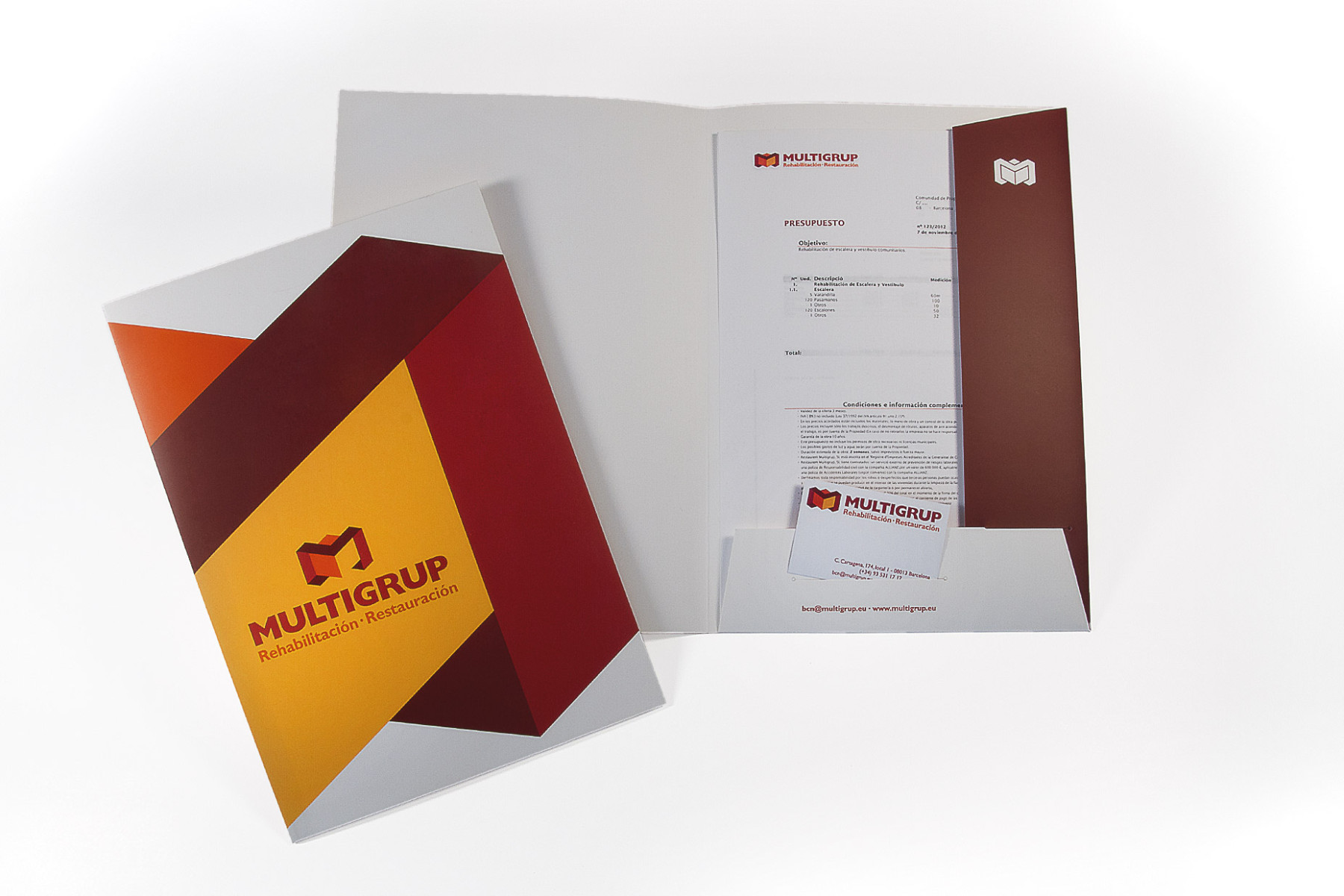
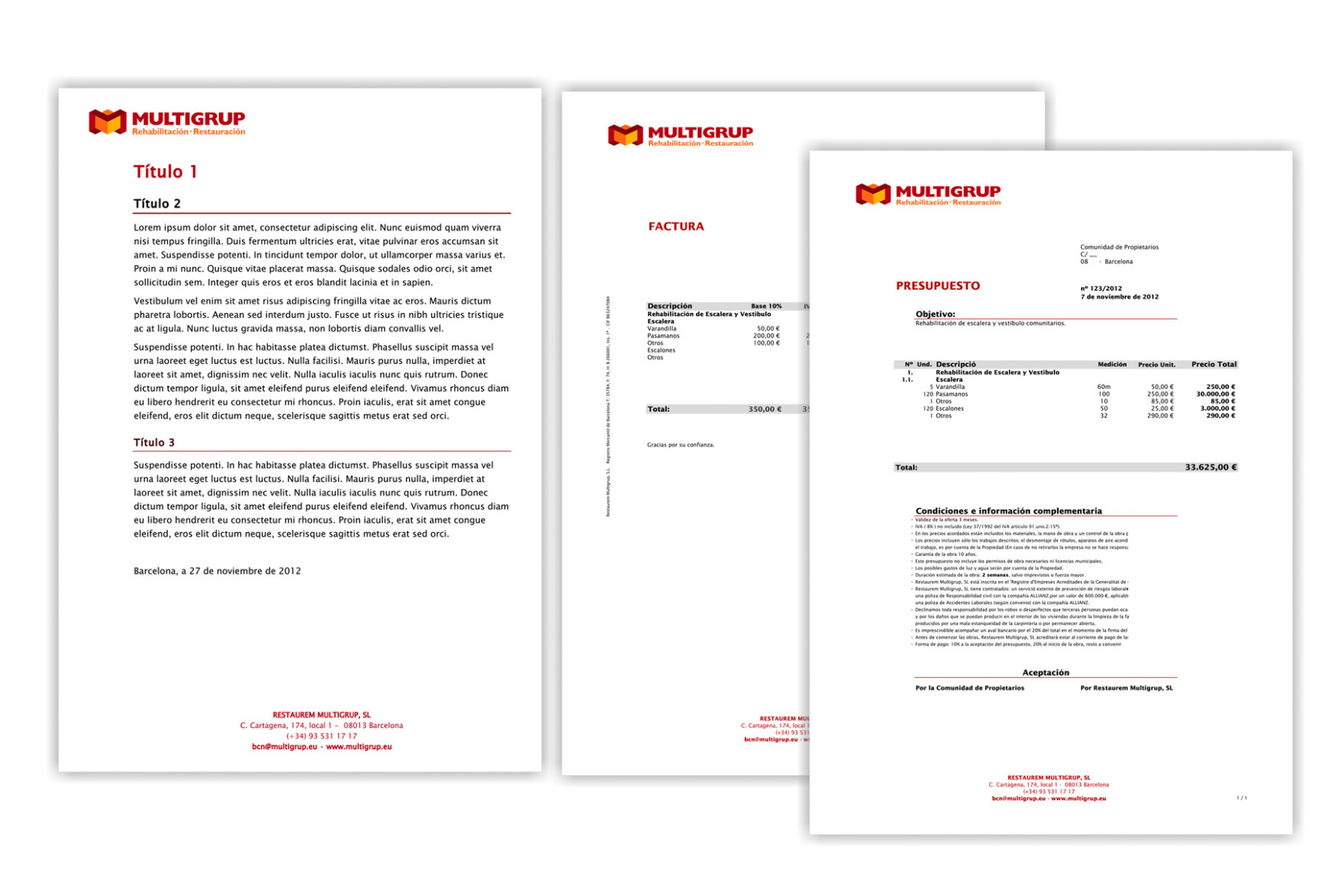
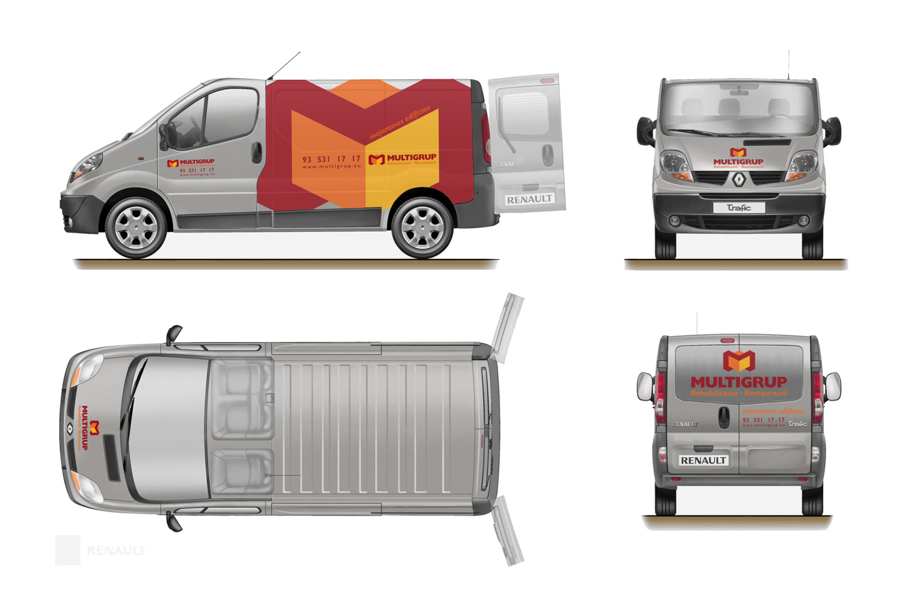
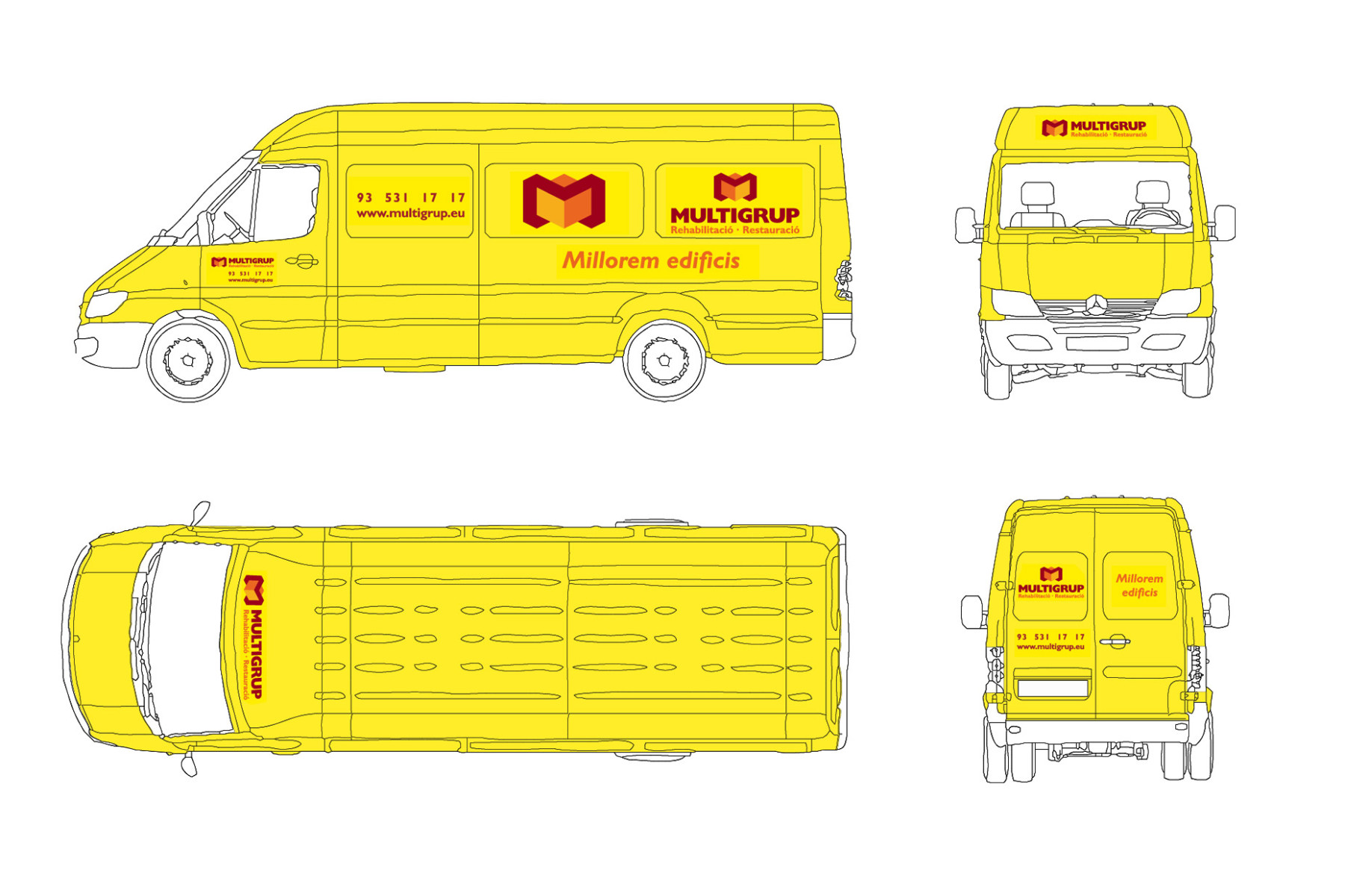
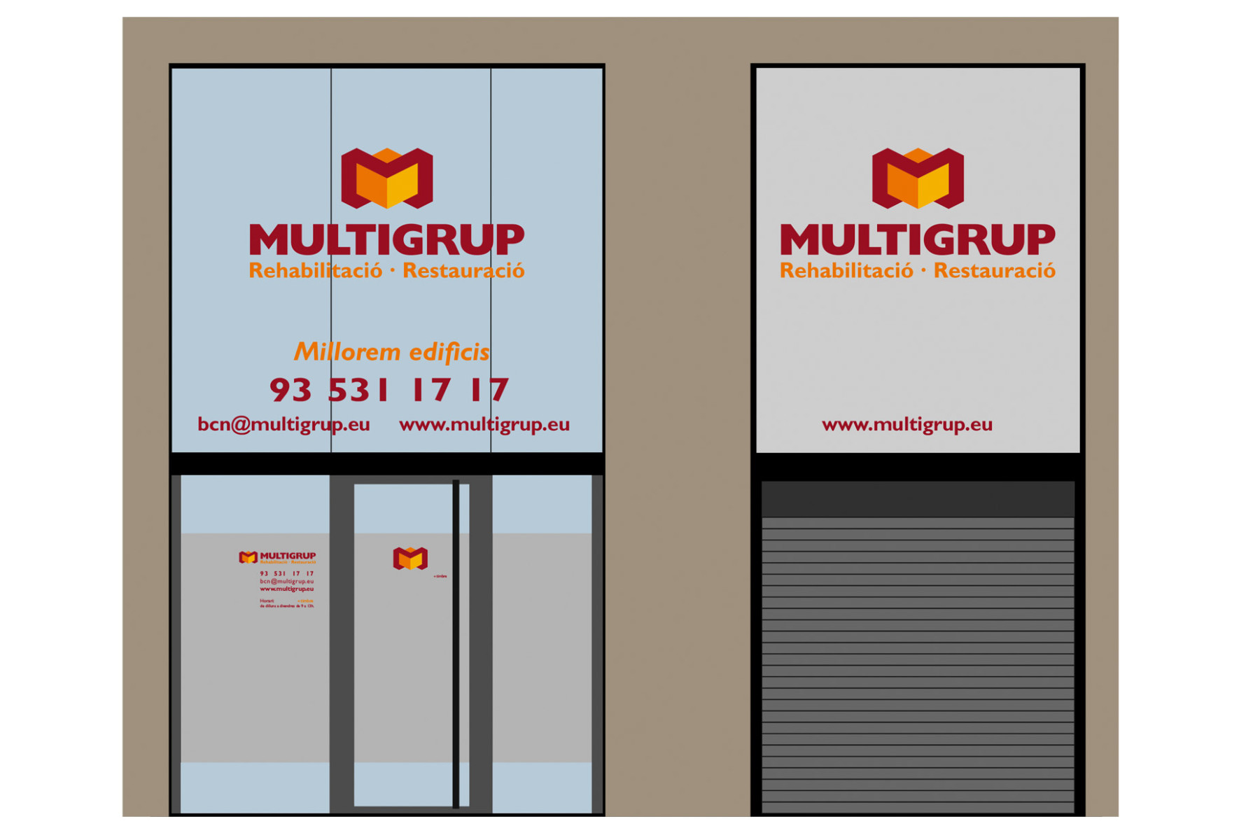
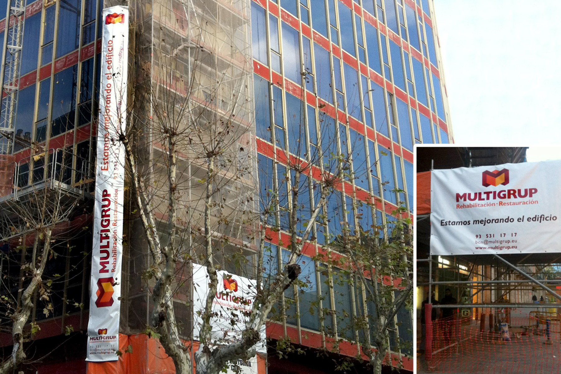
In applying the identity, we seek simplicity, clear and direct messages.
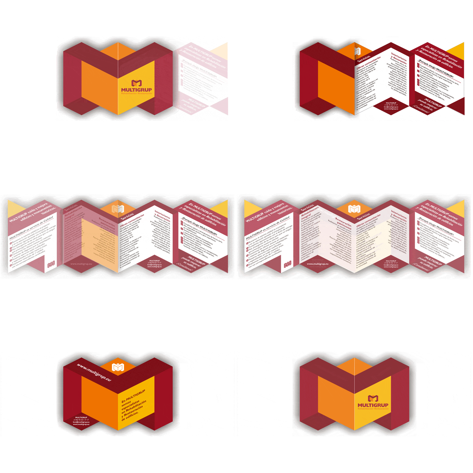
The singularity of the promotional piece is in the form (that keep the contour of the logo), where the contents follow the plans that form the elements.


