Commuting is a wholesale distributor of products related to bicycle mobility.
Challenge
Create a simple but with character and identity that would make reference to the concept “commuting” and related to the world of cycling, without falling into clichés.
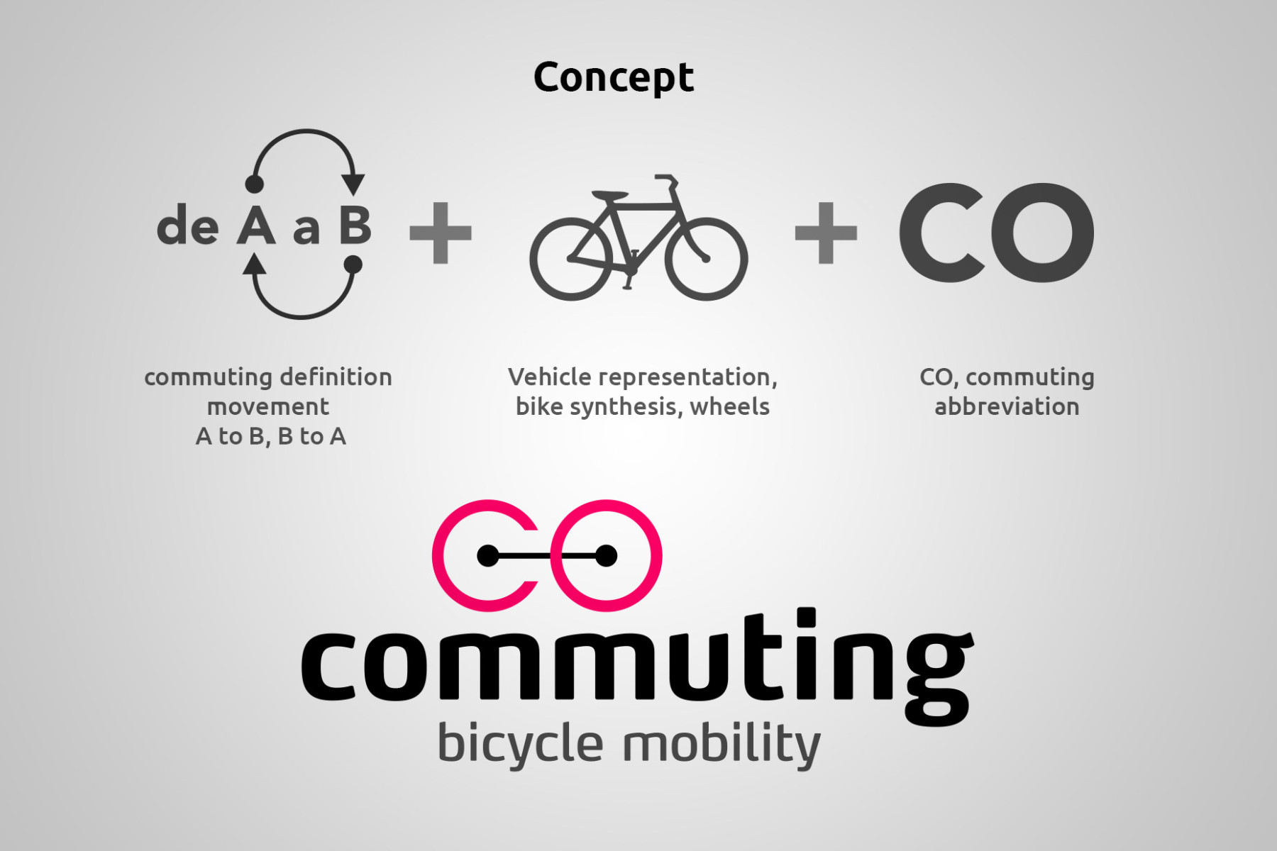
Commuting is a popular expression that refers to movement regularly conducted between our home and place of work / study.
Solution
The icon symbolizes the connection from one point to another and conveys the essence of mobility on two wheels forming the first syllable of the mark, ‘co’ of commuting.
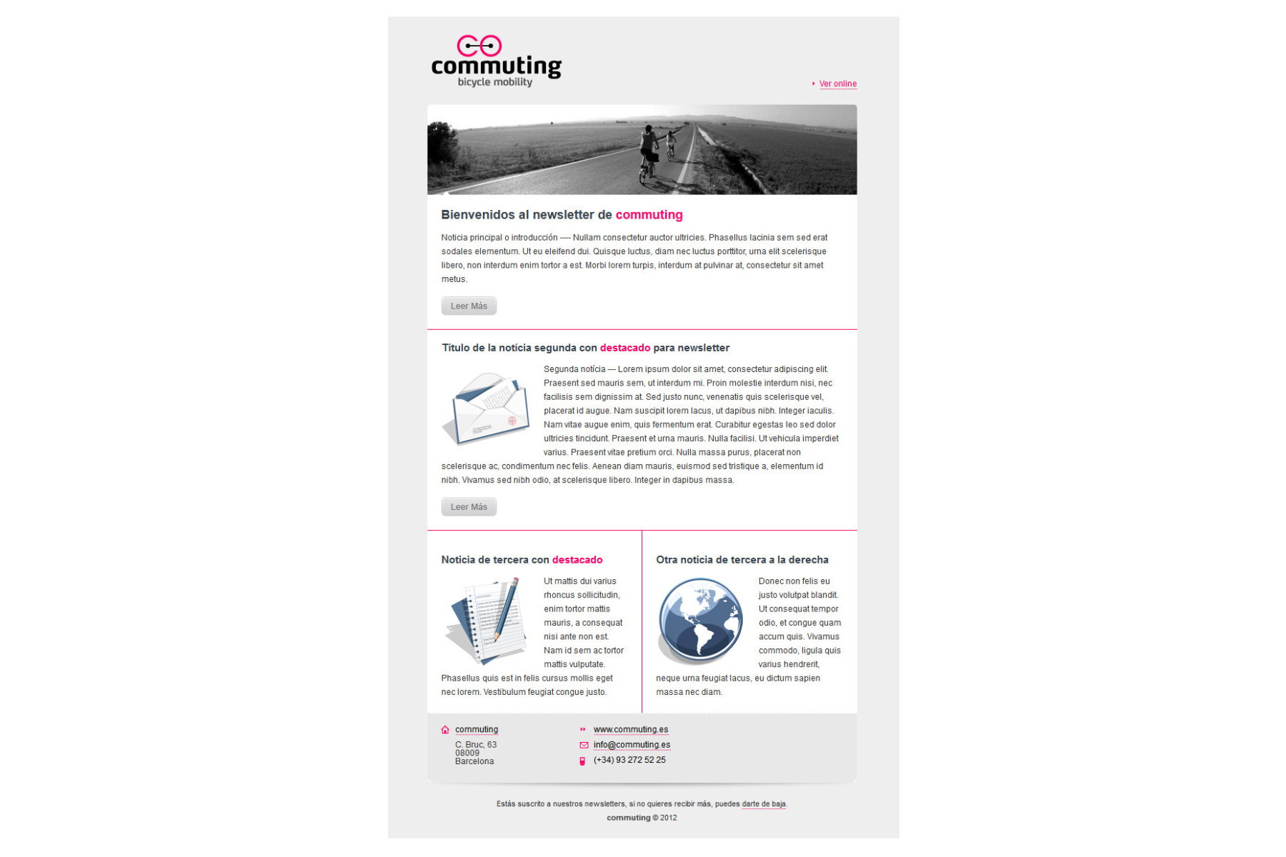
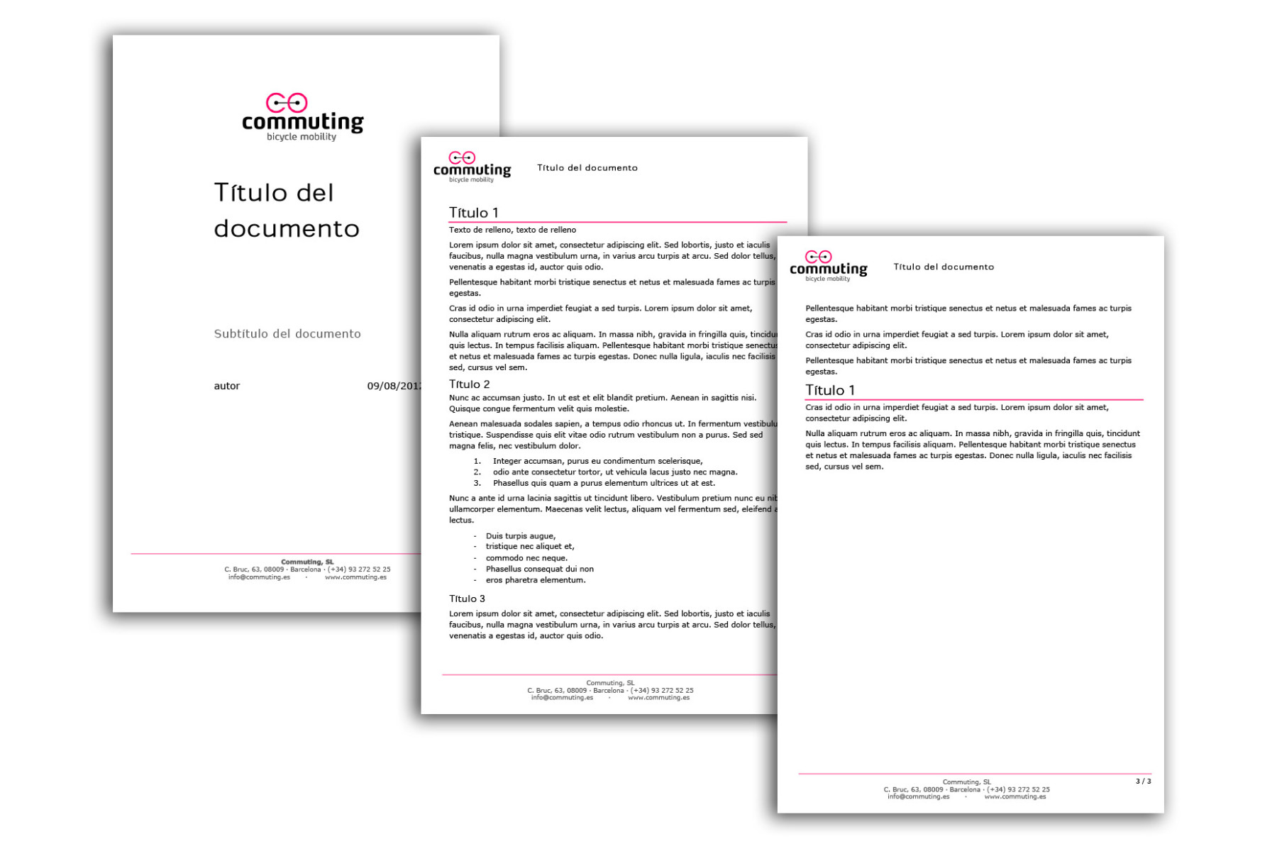
While the icon is expressed in very thin forms, typography is expressly bold, the assembly is contrasted and color gives it character.
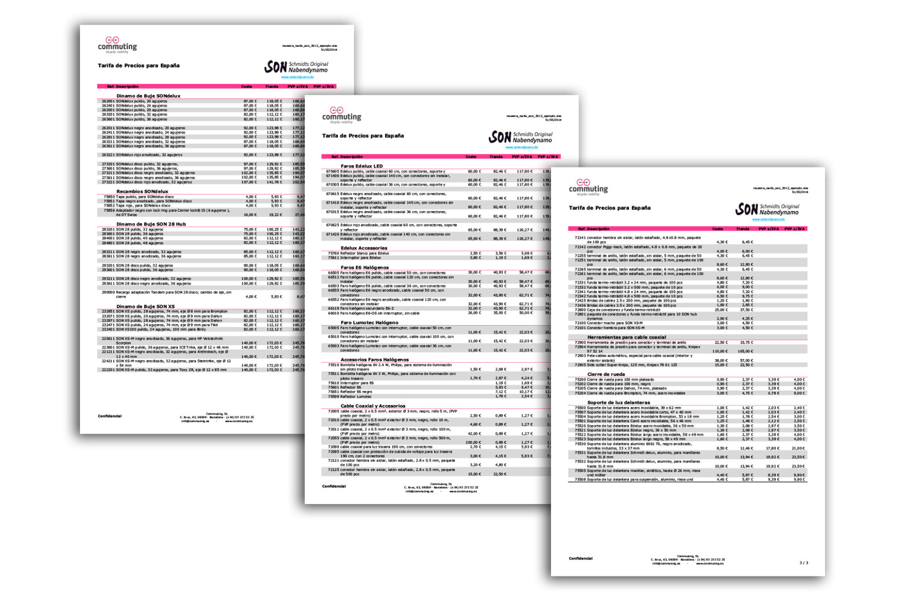
The set of elements of identity, though sober, are marked by thin lines, referring the logo, an intentionally vivid color.


